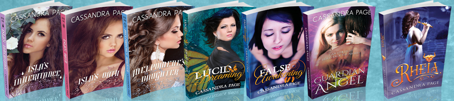
Top Ten Tuesday: Book Cover Trends
Posted: June 24, 2014 Filed under: On Books | Tags: book covers, top ten tuesday 8 Comments
This week’s Top Ten Tuesday subject is book cover trends I like or dislike (or both!). I’ve mixed it up, colour-coding accordingly. But I can only think of two trends that I really dislike, and one I’m sitting on the fence on. Although there are bad examples of every trend I’ve listed, I’m more predisposed to loving the others.
I haven’t listed ten trends, only seven. That being said, I’ve got twelve examples of those seven. That TOTALLY counts, right?
Decapitated models. I’m not talking about covers that only show one part of the body, but the ones where the model is visible except for his or her (or their) face, which is cut off by the top of the page. It’s particularly common in YA at the moment—a popular example would The Moral Instruments trilogy by Cassandra Clare. (Although they have chins, I guess…) I get why book designers do this—to let the reader imagine the character’s appearance—but usually it looks to me like they couldn’t find the right model or, in the case of simpler covers (usually self-published), didn’t have the skills to Photoshop any changes required onto the stock image.

Body parts. It may seem fussy of me to not like decapitated models but like covers with body parts, but I do. It’s a question of whether it looks unfinished or deliberate. Twelve Steps by Veronica Bartles is an adorable example of only showing the feet that I think was done well; Cinder by Marissa Meyer is great too.


Models facing the other way. Another (IMO superior) way to not show the model’s face is to use stock where the model’s back is to the viewer. Ideally the thing they are looking at should also be interesting, and if they’re in a fabulous outfit all the better. The Archon by Sabrina Benulis is a good example of this. Anna Dressed in Blood by Kendare Blake is another. (Their hair is blowing the same way. What’s that all about?!)


Inexplicable formalwear. I love a good ball gown as much as the next girl. But when a story has a modern setting and not a prom in sight, why is the main character dressed in a gown on the cover? Fallen by Lauren Kate has such a cover (and also a model hiding her face, although at least it hasn’t been lopped off). It’s gorgeous, but left me scratching my head.

Handwriting on a simple background. Although not my favourite cover type, this can be really striking when done right; at least, the covers certainly stand out. John Green’s The Fault in our Stars and J. K. Rowling’s The Casual Vacancy are both great, very distinct examples. I don’t know what Green’s other covers are like, but in Rowling’s case this style of cover tells the reader very clearly, “This isn’t Harry Potter!” It’s not my favourite cover (probably because of the colours) but I can see what it’s doing.


Abstract covers. I LOVE abstract covers—especially combined with bright colours (either a little splash or a whole lot). Blackbirds by Chuck Wendig (in fact, all of the Miriam Black books) has a great cover. Take a close look: Miriam is flying apart, into dozens of birds. How awesome is that? I also love this edition of The Wild Girl by Kate Forsyth.


Silhouettes. Often these covers are also abstract (have another look at The Wild Girl, above), but not always. Silhouettes are another great way to let the reader imagine the character for themselves while still showing them. For example, Graceling by Kristin Cashore or Santa Olivia by Jacqueline Carey. (Yes, I know the top of Loup’s scalp in that second cover is missing. But her face is still there.)


What’s your favourite (or least favourite) cover trend?


Ah! You didn’t mention big faces. They were all the rage for a while. I’m a fan of the face cover, especially Starters and Enders by Lissa Price. The hair is blowing to the right because that direction leads you into the book. If it was blowing to the left, it would effectively lead you out and away from the story, and it would feel wrong 🙂
That makes sense. I was looking at other covers last night and noticed most of them blow right. Some blow left, but in those cases the character is usually looking to the right.
Just to add, if you look at the other cover examples you’ve used, they mostly have some form of movement to the right side of the cover. Jace’s body is angled to the right; the feet books are facing right (in the case of Twelve Steps, the more animated feet are pointing right); Luce is facing right; etc. Not all covers do this, and sometimes it’s not as obvious. Graceling, for example, she is facing left, but her weapons draw you to the right side of the book. And now my analysis is done lol 🙂 sorry for the lesson in cover design, but I just love this stuff!
Don’t be sorry! I find it fascinating too!
Abstract covers, silhouettes and pretty handwriting are some of my favorite cover trends! The Graceling Realm covers are actually some of my favorites! So gorgeous! Great list!
Nicole @ The Quiet Concert
Silhouettes made my list too, they always look so great and make the cover stand out even more. I really love your Abstract examples too, especially The Wild Girl, that one looks gorgeous. Also, simple covers with just text on them are some of my favourite, simplicity is always best. Great list!
I feel like you can never go wrong with silhouetting an image. I think I find that the sense of perceived anonymity is often much better than having a cover model off-focus (or simply cutting their head off of the image). But maybe I just find them more striking in appearance, haha.
Cheers,
joey via. thoughts and afterthoughts
I never thought about the whole “leaning to the right” thing in book covers, but now it’s so obvious. I wonder if, in the cultures where they read right-to-left, book covers are more inclined to the left?